You set up your LinkedIn profile, dropped in a banner image, and it came out blurry, stretched, or cropped right through the middle of your text. You are not alone. The single most common reason a LinkedIn banner looks unprofessional is the wrong size, and the fix takes about thirty seconds once you know the number.
This guide is for anyone setting up or refreshing a LinkedIn presence: a personal profile, a company page, or both. I have spent more than fifteen years helping professionals and brands get LinkedIn right, I teach social media at Rutgers Business School, and I have written several books on the platform, including Maximizing LinkedIn for Business Growth. I will give you every current LinkedIn image dimension, then show you how to design a banner that actually does its job.
And I will be honest with you up front. My own visual branding has been all over the place for years. So this is as much a reminder to me as it is a guide for you.
Key Takeaways
? The recommended LinkedIn banner size for a personal profile is 1584 x 396 pixels, a 4:1 ratio, with a maximum file size of 8MB.
? A LinkedIn company page cover image is a different size: LinkedIn recommends 4200 x 700 pixels, a 6:1 ratio, with a maximum file size of 3MB.
? LinkedIn crops banners differently on mobile and desktop, so keep your text, logo, and any faces in the center of the image.
? Export as a high-resolution PNG or JPG and start from a source file larger than the final size to avoid blur from LinkedIn’s compression.
? Consistency beats creativity. Match your banner to the same colors and fonts you use everywhere else, and resist the urge to redesign it too soon.
What size should your LinkedIn banner be?
The recommended LinkedIn banner size for a personal profile is 1584 x 396 pixels, displayed at a 4:1 aspect ratio. According to LinkedIn’s own cover image specifications, the file should be a JPG or PNG kept under 8MB. This is the image that sits behind your profile photo at the top of your page.
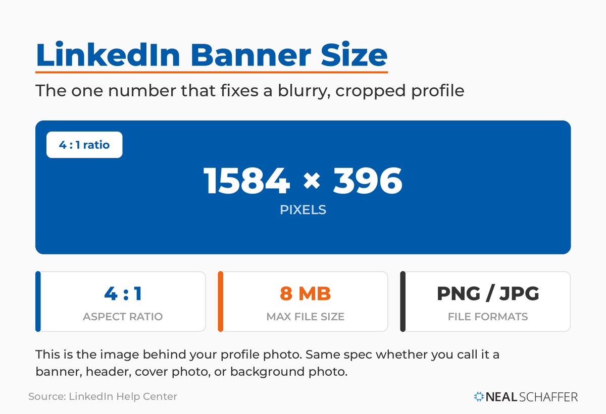 The personal LinkedIn profile banner is 1584 x 396 pixels at a 4:1 ratio, supports PNG or JPG, and caps at 8MB. Banner, header, cover photo, and background photo all name this same image.
You will see this same image called a few different things: a LinkedIn banner, a header, a cover photo, or a background photo. They all refer to the same 1584 x 396 space on your personal profile. The name changes, the dimensions do not.
Company pages are different. LinkedIn’s official Pages image specifications recommend a company page cover image of 4200 x 700 pixels, a 6:1 ratio, saved as a PNG or JPEG under 3MB. You may still see 1128 x 191 listed elsewhere, which is the older, smaller spec at the same 6:1 ratio, so it works too, but 4200 x 700 is LinkedIn’s current recommendation. LinkedIn also advises keeping key details away from the edges of the cover, especially the lower-right corner, and centered so they stay visible as the image is cropped across different screens. Here is a quick reference for the two banner types most people need.
| Banner type | Recommended size | Aspect ratio | Max file size |
|---|
| Personal profile banner | 1584 x 396 px | 4:1 | 8MB |
| Company page cover | 4200 x 700 px | 6:1 | 3MB |
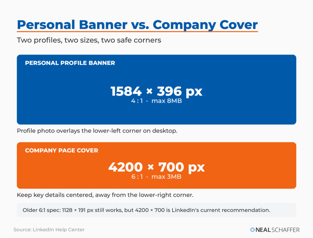 Two profiles, two sizes. The personal banner is 1584 x 396 at 4:1; the company page cover is 4200 x 700 at 6:1. The older 1128 x 191 cover still works at the same ratio.
That banner is prime real estate. It is one of the first things a visitor sees, and a blank gray default tells people you stopped setting up your profile halfway through. Get the size right and you have a clean canvas to work with.
What are all the LinkedIn image sizes in 2026?
LinkedIn uses different dimensions for nearly every image type, from your profile photo to feed posts to company page modules. The table below covers the full set in one place so you can stop searching for them one at a time. All dimensions are recommended sizes confirmed against current platform guidance; LinkedIn resizes anything that falls outside its ratios, which is where cropping and blur creep in.
| Image type | Recommended size | Notes |
|---|
| Personal profile photo | 400 x 400 px minimum | 1:1, circle crop, PNG or JPG, max 8MB, no GIFs |
| Personal profile banner | 1584 x 396 px | 4:1, max 8MB |
| Company page logo | 400 x 400 px | Square |
| Company page cover image | 4200 x 700 px | 6:1, keep key elements centered, max 3MB |
| Life tab main image | 1128 x 376 px | Company pages |
| Life tab custom module image | 502 x 282 px | Company pages |
| Life tab company photos | 900 x 600 px | Company pages |
| Feed post, square (1:1) | 1080 x 1080 px | Within LinkedIn’s 3:1 to 4:5 range, 1080 px wide recommended |
| Feed post, vertical (4:5) | 1080 x 1350 px | Tallest ratio LinkedIn allows, takes up more feed space |
| Feed post, horizontal (3:1) | 1080 x 360 px | Widest ratio LinkedIn allows |
| Link share preview | 1200 x 627 px | 1.91:1, must be over 200 px wide |
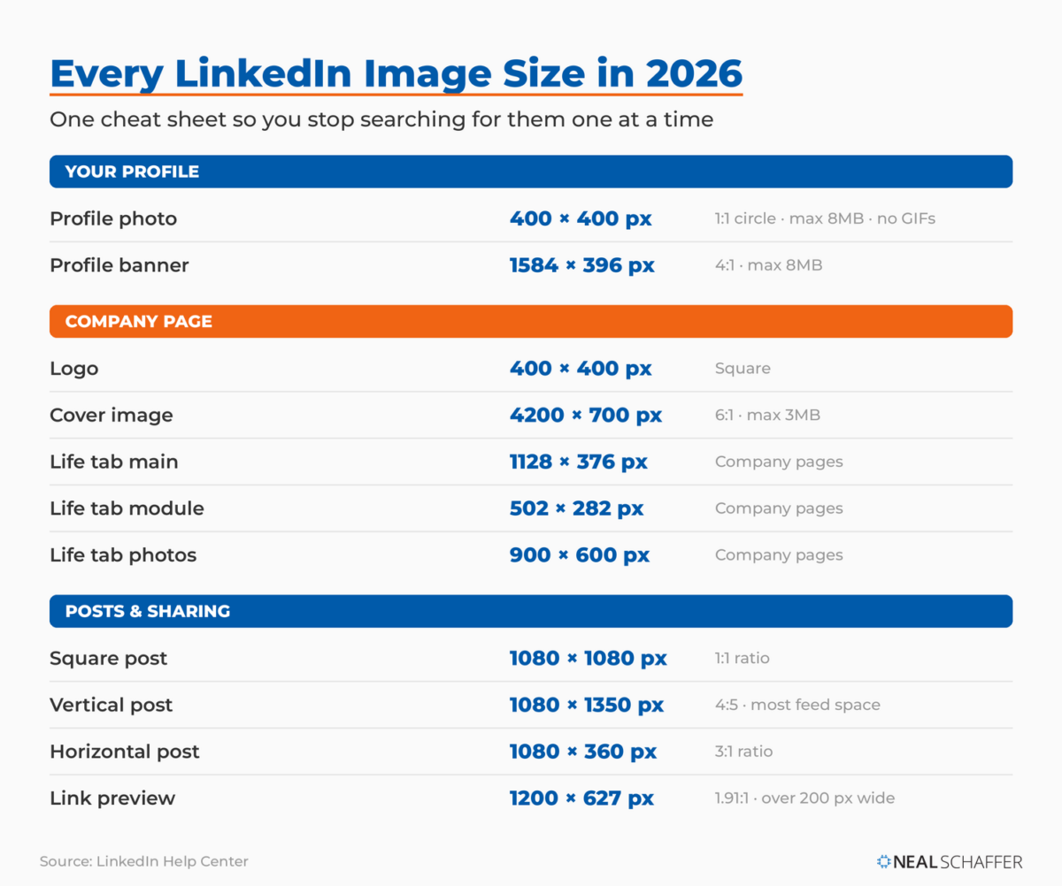 Every current LinkedIn image dimension in one place, from the 400 x 400 profile photo to the 4200 x 700 company cover and the 1080 px feed-post sizes. All figures from LinkedIn’s Help Center.
Every figure in this table comes from LinkedIn’s own help center: the profile photo specifications, the company logo, cover, and Life tab sizes from the Pages specifications linked above, the feed-post aspect ratios, and the 1200 x 627 link-preview size from that same Pages page.
A few notes worth keeping in your back pocket. Your profile photo is always cropped into a circle, so center your face and leave margin on all sides. Upload it larger than 400 x 400 (something closer to 640 x 640 or above) so it stays sharp on high-resolution screens. And the 1200 x 627 link image is the one that shows when you share a blog post or article, so set that as your Open Graph image on your website and LinkedIn will pull it automatically. If you publish LinkedIn carousel posts or share images alongside your LinkedIn posts, the square 1080 x 1080 and vertical 1080 x 1350 sizes are your safest defaults. LinkedIn accepts any feed image from a 3:1 to a 4:5 ratio and caps uploads at 5MB, so anything inside that band displays without forced cropping.
Where do LinkedIn banners get cropped, and how do you design around it?
LinkedIn crops your banner differently depending on the device. On desktop your profile photo and name overlay the lower-left corner of the banner, and on mobile the image gets trimmed at the sides and bottom. The fix is simple: keep your text, logo, and any faces in the center of the image, well away from the edges and that lower-left corner.
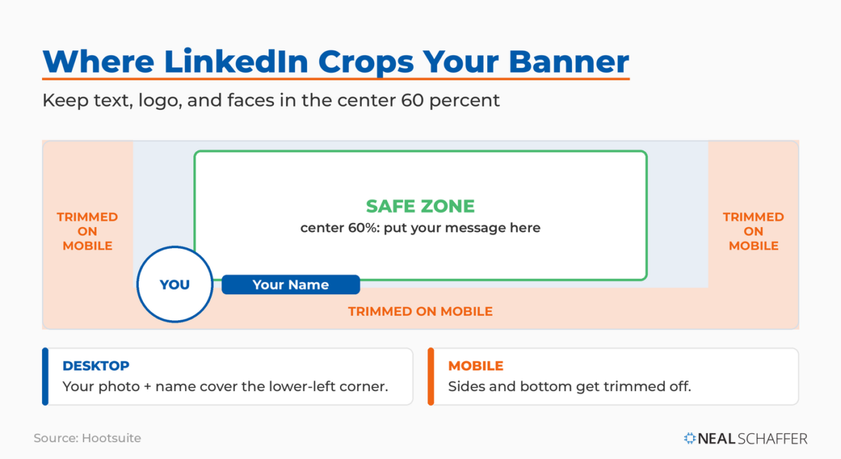 LinkedIn crops your banner differently on desktop and mobile. Keep your message in the center 60 percent, clear of the lower-left corner your profile photo covers and the edges mobile trims.
Hootsuite makes the same point plainly, noting that cover photos are cropped differently on mobile and desktop, so you should view your profile on both before you call it done. I have lost count of how many banners I have seen with a tagline running right off the edge on mobile, or a phone number tucked into the exact spot the profile photo covers.
Treat the center 60 percent of the banner as your safe zone. Put the one thing you most want a visitor to read, a value proposition, a website, a single line of positioning, in that center band. Everything outside it is decoration that may or may not survive the crop. Remember too that your headline sits right below the banner, so the two work together. If you are still refining your LinkedIn headline, design the banner to complement it rather than repeat it.
A LinkedIn banner should be a PNG or JPG file, sized at 1584 x 396 pixels, and kept under the 8MB maximum. To avoid blur, start from a source file larger than the final display size and let LinkedIn scale it down, rather than uploading something small and watching the platform stretch it. PNG holds sharp edges and text better; JPG keeps photo-heavy designs lighter.
Compression is the quiet culprit behind most fuzzy banners. LinkedIn re-compresses what you upload, so a low-resolution starting image only gets worse. LinkedIn’s own fix for a blurry cover is counterintuitive but correct: choose an image with a larger file size, and lean toward photos over logo-heavy graphics, which tend to compress worse. Export at full resolution, keep the file comfortably under 8MB, and your banner will hold up across desktop and mobile. If yours already looks soft, re-export it from the original design at a higher quality before you blame the platform.
This is also where the right tool saves you. As an Adobe Express brand ambassador, I reach for Adobe Express first: it has a 4:1 LinkedIn banner format built in, free templates, and a one-click resize that turns the same design into other formats so you do not rebuild from scratch. Canva does the same job if that is what you already use. Either way, the point is to design at the correct dimensions from the start instead of cropping a stray photo and hoping.
What makes a LinkedIn banner actually effective?
An effective LinkedIn banner is legible, on-brand, and consistent with the rest of your visual identity. Beyond getting the 1584 x 396 dimensions right, that means high contrast so text stays readable against the background, a clear focal point in the center safe zone, and the same colors and fonts you use across your other profiles and your website.
That last point matters more than most people think. On a recent episode of my podcast Your Digital Marketing Coach, I shared the one idea from my conversation with Jim MacLeod, author of The Visual Marketer, that stuck with me:
“As soon as you get sick of your visual brand, your audience is just starting to recognize it.”
Most of us refresh our visuals way too early, right when momentum is building.
On that same episode, Jim broke brand consistency down like a pyramid. Your logo sits at the top. Beneath it come your colors and typefaces, and if you can own a single color the way Coca-Cola owns red, people start recognizing you even when your logo is not visible. Everything else flows from there. Your banner is part of that system, not a one-off design exercise, so it should carry the same colors and fonts as your headshot, your posts, and your website.
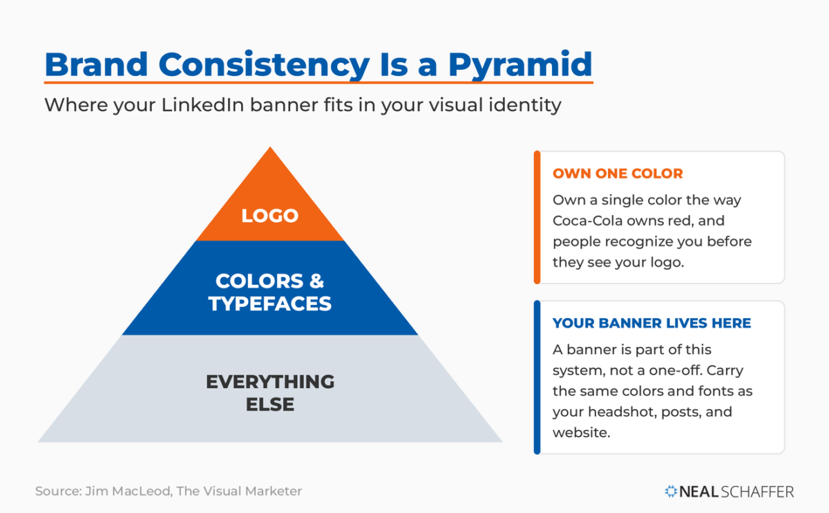 Jim MacLeod’s brand-consistency pyramid: logo at the top, colors and typefaces beneath, everything else at the base. Own one color the way Coca-Cola owns red and people recognize you before they see your logo.
If picking those colors is the part that stops you, Jim’s recommendation was Adobe’s free Adobe Color tool, which takes one base color and generates complementary options around it. Whatever you land on, save them as a brand kit in your design tool so every future banner, post, and graphic stays consistent without you having to think about it.
The mistake most people make with their LinkedIn banner
The most common mistake is treating the banner as decoration and redesigning it on a whim. People cram in five fonts, three colors, and a stock photo that has nothing to do with their work, then swap the whole thing out a month later because they got bored. Consistency is the strategy. A clean banner that matches your brand and stays put will always outperform a clever one that changes every few weeks.
I will admit I almost made this mistake myself. I was about to redo my entire logo, and talking through visual identity on that podcast episode made me rethink it. The discipline is simple: design the banner well once, then leave it alone.
A great LinkedIn banner answers a simple question for the visitor: what do you do, and why should I care? The dimensions and best practices here get the technical part right. The creative side is where you win attention: the messaging, the imagery, and the personal branding angle of your LinkedIn background photo. That work also feeds your broader LinkedIn marketing strategy. And it pairs with a professional LinkedIn headshot and a fully built-out profile to make the whole top of your page work as one unit.
Frequently Asked Questions
What is the best LinkedIn banner size? The best LinkedIn banner size for a personal profile is 1584 x 396 pixels at a 4:1 aspect ratio, with a maximum file size of 8MB. This displays cleanly across desktop and mobile. Company pages use a different cover size, which LinkedIn recommends at 4200 x 700 pixels with a 3MB maximum.
Why does my LinkedIn banner look blurry? Blur usually comes from uploading a low-resolution image that LinkedIn then compresses and stretches. Start from a source file larger than 1584 x 396 pixels, export at full resolution as a PNG or JPG, and keep it under 8MB. Re-exporting from your original design at higher quality almost always fixes it.
Is the LinkedIn banner size the same as the background photo size? The terms are used interchangeably, and only company page cover images use a different dimension, which LinkedIn recommends at 4200 x 700 pixels.
Where do I place text on a LinkedIn banner so it doesn’t get cut off? Keep text within the center 60 percent of the banner, away from the edges and the lower-left corner where your profile photo overlays on desktop. LinkedIn crops the sides and bottom on mobile, so always preview your banner on both desktop and a phone before finalizing it.
What size is a LinkedIn banner for a company page? LinkedIn recommends a company page cover image of 4200 x 700 pixels, a 6:1 ratio, saved as a PNG or JPEG under 3MB. Keep important text and visuals centered and away from the lower-right corner so nothing critical gets cropped. This is different from the 1584 x 396 personal profile banner.
Get Your LinkedIn Banner Right
Start with the number that matters most: 1584 x 396 pixels for a personal profile, 4200 x 700 for a company page. Design at those dimensions from the start, keep your key elements centered, export a high-resolution PNG or JPG under 8MB, and match the colors and fonts you use everywhere else. Then leave it alone long enough for people to recognize it.
Once the size is handled, the real work is what you put on the banner. If you want to make yours actually pull its weight, my walkthrough on creating a LinkedIn background photo covers the messaging and design choices that turn a correctly sized image into a genuine first impression. And if you want to see what the data says about how people behave on the platform before you commit to a design direction, the latest LinkedIn statistics are worth a look.
If you would like a deeper playbook for turning your whole LinkedIn presence into a source of business, you can download a free preview of Maximizing LinkedIn for Business Growth and start there.
Actionable advice for your digital / content / influencer / social media marketing.
Join 13,000+ smart professionals who subscribe to my regular updates.