Most marketers know email marketing works. Even if you don’t have hard data from your own brand, you’ve probably opened and engaged with a few great promotional emails yourself. Not all emails are created equal, however. While some stand out with strong messaging and clean layouts, others get lost in crowded inboxes because of poor email design and half-baked marketing tricks.
Why does that matter? Whether it’s a newsletter or a cold outreach message, email is often your company’s first impression.
First impressions count!
Well-designed emails don’t just look good—they build trust, improve engagement, increase requests coming into your subscription center, and help nurture leads.
In this post, I’ll walk you through the best practices, core principles, and current trends of email marketing design. The goal is simple: to help you create emails that not only look professional but also perform better.
What Exactly is Email Design?
Email design is more than just making things look nice. It’s the layout, visuals, typography, colors, and calls-to-action working together to support your message and guide your reader to take the next step.
Design shapes how your message is received. A cluttered layout or hard-to-read font can make even a great message feel overwhelming. Good design ensures your emails are clear, consistent, and easy to engage with—especially on mobile devices, where most emails are read.
Think of it this way: content is what you say, while design is how you say it. In today’s crowded inbox, how you say it is just as important as what you say.
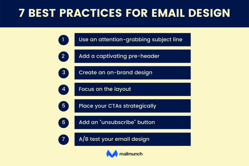
5 Key Principles of High-Converting Email Design
The best email designs strike a balance between visual appeal and strategic structure. Whether you’re promoting a product, sharing an update, or guiding someone through your sales funnel, your design choices directly affect how readers respond.
Here are five core principles that help email designs perform better.
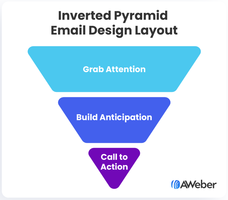
1. Layouts That Work: Single Column and Inverted Pyramid
 Source
Flashy, complex layouts might seem impressive, but they often get in the way. Simplicity is key, especially in email.
A single-column layout is one of the most effective formats rather than a multi-column layout. It’s easy to scan, mobile-friendly, and loads quickly. With over 60 percent of emails opened on phones, this layout helps ensure your message gets across no matter the device.
Another smart option is the inverted pyramid layout. It starts with a bold headline, follows with short, compelling text, and finishes with a strong call-to-action. This structure naturally draws the reader’s eye toward your main goal, whether that’s a click, signup, or purchase.
Whichever layout you choose, keep it clean. Use short paragraphs, clear spacing, and just enough visuals to support your message without overwhelming it. And if you include multimedia like videos or image galleries, link out to them rather than embedding everything inside the email.
Simple layouts not only look better across devices, they’re more effective at keeping attention and prompting action.
2. Typography That’s Readable and On-Brand
Typography plays a bigger role than most people think. The fonts you use help set the tone and shape your reader’s experience. Your emails should feel like a natural extension of your brand. That means the typefaces, font sizes, and overall style should align with what subscribers already see on your website or social channels.
Start by using your brand font. If your email platform doesn’t support it, choose a web-safe alternative that’s similar in style. Fonts like Arial, Calibri, or Times New Roman are solid choices because they’re easy to read on any screen.
Keep decorative fonts to a minimum. While they might look fun on desktop, they’re often hard to read on mobile. Use them sparingly, such as in a logo or headline, and stick with clean, readable text for body copy and buttons.
Also, pay attention to tone. If your brand voice is quirky, serious, conversational, or bold, your typography should support that vibe. Consistency across design and voice helps build trust and recognition.
Bottom line: your font should feel like your brand and be effortless to read.
Is Your LinkedIn Working?
Just released: my new book to help professionals, entrepreneurs, and business owners maximize LinkedIn for real growth.
With years of LinkedIn expertise, Maximizing LinkedIn for Business Growth offers actionable steps to build your brand, expand your network, and drive results.
Start leveraging LinkedIn like never before—grab your copy now! Click the cover or button below to buy on Amazon.
Calls-to-action are where the real value happens. Whether you’re asking readers to sign up, shop, download, or learn more, your CTA should be clear, visible, and easy to interact with.
Use short, action-driven language like “Get the Guide,” “Book Now,” or “See the Sale.” Be specific. Avoid generic phrases like “Click Here,” which don’t tell people what they’ll get.
Placement is just as important. Put your primary CTA near the top of the email so readers see it without scrolling. If your message is longer, it’s okay to repeat the button later for emphasis, but don’t overwhelm the reader with too many options.
Use buttons, not just text links. A bold, well-sized button with contrasting color and enough padding stands out and is easier to tap on mobile.
Keep it simple. One main CTA per email is usually enough. Giving too many choices can confuse people and reduce clicks.
A strong CTA should guide the reader to take action without hesitation. Make it easy, obvious, and relevant.
4. Imagery and Visual Hierarchy
 Source
Images can enhance your message, but only if they’re used intentionally. Good email design is about focus, and cluttered visuals can dilute your message instead of supporting it.
A strong hero image can set the tone and quickly communicate the purpose of the email. Use additional images only when they add clarity or help drive the point home. Avoid stock imagery that feels generic or off-brand.
Design with hierarchy in mind. Lead with a bold headline or striking image, then follow with short, skimmable text and a clear CTA. This top-down approach helps guide the reader’s eye through the content in the right order.
Also, think about scannability. Most people read emails quickly. Use visual cues like section breaks, headers, and spacing to help them move through the content easily.
If you want to include multimedia, such as a video or animated walkthrough, it’s often more effective to link to it. A simple image preview with a button like “Watch the Demo” is faster to load and more mobile-friendly than embedding a full video.
Keep it clean. Let images support your message, not distract from it.
5. Color Psychology in Emails
Color choices do more than just reflect your brand. They influence how your message is perceived and how readers feel when they engage with it.
Stick to your core brand colors for consistency, especially in logos, headers, and CTAs. But don’t stop there. Consider the psychological impact of different colors. Red creates urgency and grabs attention, which is why it’s often used for sales or limited-time offers. Green suggests health and calm, making it ideal for wellness or sustainability-focused messaging. Blue builds trust and conveys professionalism.
Match your color choices to your message. If you’re promoting a seasonal product, adjust your palette to reflect the mood—such as fresh pastels for spring or deep tones for winter.
Use color to guide the reader. A high-contrast CTA button, for example, draws the eye and improves click-through rates. But be mindful of accessibility. Make sure there’s enough contrast between text and background so everyone can read your content easily.
Color isn’t just decorative. It’s strategic! When used thoughtfully, it helps guide behavior and boost performance.
Further Reading: 15 Powerful Benefits of Email Marketing That Make It a No-Brainer in 2025
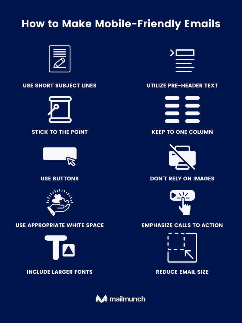
Mobile-First and Accessible Email Design
 Source
In a mobile-driven world, email campaigns must be optimized for mobile reading. From your subject line to your overall email templates, mobile optimization is essential.
Currently, around half of all emails are opened on mobile. Without mobile optimizing, half of your audience may not even see your email campaigns–or worse, hit that unsubscribe button!
Knowing the value of mobile is only half the battle. Knowing the best practices for your email campaigns is also important. A responsive design is key to help your audience fully engage with your email content. Consider the following:
- Font sizes between 16 and 22 px. Keeping your font sizes within this range will help support readability.
- Contrast ratios of 3:1 or 4.5:1. Managing a balance between fonts and white space can help improve overall readability, so make sure your email messages are within this range.
- Color and design with sharp contrast. A light background color paired with a light font color can confuse readers. Opt instead for a sharper contrast, such as a light background and dark font or dark background and light font.
Creating dynamic content can be difficult when you are not guaranteed that an email platform will accept that content or format it properly upon delivery. Thankfully, there are fallback strategies you can utilize to make sure even your dynamic content is sent correctly in your marketing email messages. Common fallback strategies include:
- Create a dedicated design for each type of recipient. A fallback can be placed with your email provider, with different content blocks showing for different capabilities.
- Focus on natural fallbacks. Many types of interactive or dynamic content have natural fallbacks (i.e. a carousel of photos stacking instead). Use these to prevent duplicate content and email mistakes.
Further Reading: Email Marketing Design: 13 Best Practices to Follow
The Top Email Design Trends for 2025
Email marketing continues to evolve, and so do your subscribers’ expectations. What worked a year or two ago might not cut through today’s crowded inbox. Staying current with email design trends isn’t just about creativity—it’s a smart way to stay relevant and competitive.
In 2025, successful emails will prioritize clarity, personalization, and interactivity. Clean layouts, mobile-first formatting, bold visuals, and smarter automation are becoming the norm. Brands that embrace these shifts will see stronger engagement and better results.
Here’s a look at the key email design trends shaping 2025, along with ideas for how to start using them in your own campaigns.
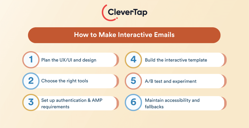
Interactive Emails & Gamification
 Source
Interactive emails can vary, but often feature animated gifs, interactive elements like buttons and slides, and even games. As interactive emails have become the norm, a wide range of companies have developed their own take on interactivity and gamification.
An email message is designed for sales and the delivery of information, but visual elements are far more important than they have been in years past. Even for more serious or enterprising email messages, gamification and interactivity are important. Hybrid layouts prioritizing both interactivity and more basic text can help bridge any gaps.
Gamification can help make interactive elements more fun and engaging. A common example is a spinning wheel to “win” a coupon code or discount. Although gamification may not be the most sophisticated of email design tools, it can be a great email strategy to improve user experience and encourage engagement.
AI-Powered Personalization
Email personalization has become the standard for email marketing, but AI-powered personalization can take market research and move it to the next level in personalization. AI personalization can dramatically improve user experience by making suggestions according to user behavior, and tailoring emails according to recipient preferences.
AI personalization can also contribute to effective visual communication. From your email header to preview text, AI can take customer insights and present an email that is highly personalized and tailored to capture audience interests.
Ultimately, AI-powered personalization can improve brand recognition and customer experience and increase the likelihood of seeing regular engagement from your audience.
Further Reading: 15 Powerful Ways to Use AI in Email Marketing
Dark Mode Compatibility
Plenty members of your audience may opt for dark mode on their phones. While this may not seem to be a problem, when emails are not optimized for dark mode, formatting can show up inaccurately on mobile.
Dark mode compatibility can be assessed and completed by using test emails and A/B testing. Using these forms of evaluation can ensure that all of your emails are being thoroughly evaluated.
Simple tips to ensure your content is optimized for dark mode include:
- Using transparent image backgrounds. By using images with transparent backgrounds, you can make sure that your images do not show up as strange blocks of color against a dark background.
- Prioritize neutrals. Bright colors are often great attention-grabbers, but neutrals will show up well no matter the background and color contrast.
Ethical & Sustainable Design
Design can be both ethical and sustainable, to make sure you are making the most of your email campaigns without sacrificing the well-being of environments and audiences.
Ethics are a frequent topic of discussion in marketing, because modern solutions are designed to uphold ethical values while creating marketing campaigns. Consent is perhaps one of the most important aspects of ethical email delivery, as it makes sure that all emails are willfully and intentionally received.
Sustainable design may not be quite as easy to define. From website functionality to email hosting, sustainable design is typically identified as any design that minimizes resource utilization and makes use of the least intrusive servers or data centers.
Digest format emails deliver quick and concise updates or ideas. Unlike long-form content, digest formats focus on presentation, design, and simplicity. They can be sent twice a week, twice a month, or even once each quarter–the timing itself does not matter. Instead, digest emails are best approached from the perspective of simplicity, with general overviews.
The subject line of digest emails are often similarly simple, such as a quick “What’s happening this week,” or “This week at [Brand’s Name].” Digest emails can contain your social media icons and standard conclusions, but will lack the urgency and calls to action that is common in transactional emails and longer content.
Further Reading: 19 Email Marketing Examples to Inspire Better Results
Common Mistakes to Avoid in Email Design
From winding up tangled in spam filters, to using one too many animated GIFs, there are a handful of mistakes you can make while developing your marketing email strategy. Some of the most common mistakes I find marketers making include:
- Overuse of images. Images are a great way to garner customer support and capture attention. Used too much, however, images can make loading times slow and ineffective and can look cluttered. Opt for a handful of images per email.
- No alt text. Alt text is an essential part of driving site traffic in optimization, but is it really that important for email marketing? Yes! Alt text lets your audience know not only the substance of an image, but also the purpose of its inclusion within the email. It helps establish content hierarchy just as headings help.
- Bad mobile layout. As previously discussed, visual storytelling is important. If the mobile layout of your emails is awkward, difficult to see, or is nearly incohesive, your audience will have a negative user experience and may unsubscribe.
- Tiny or invisible CTAs. Calls to action are important to make sure that your audience is engaging with your emails and actively working within the parameters of your brand’s needs. Although your email does not need to be a solid block of ad copy, encourage your readers to complete an action, whether that is through text, a button, or an image.
Drag-and-drop email builders can help marketers create email templates that work for a multitude of purposes. Leverage these different email templates and other tools at your disposal to increase brand recognition, improve email deliverability, and appeal to human nature for regular engagement and consistent growth.
Further Reading: Mastering Email Marketing Campaigns: From Planning to Execution
Final Thoughts on Mastering Email Marketing Design for Better Results
 Source
At its core, great email marketing design is about strategy. It is not just about making emails look nice; it’s about helping your message land, building trust with your audience, and guiding people toward action.
Design should never distract from the content. Instead, it should enhance clarity, support your brand identity, and make it easy for the reader to know what to do next. Whether you are asking someone to make a purchase, register for an event, or read a blog post, your design choices should serve that goal.
Trends can be helpful, but don’t follow them blindly. What works for another brand may not make sense for your audience or objectives. Focus on what helps your emails perform better, not just what looks current. That means staying true to your voice, being intentional with visuals, and keeping the experience user-friendly—especially on mobile.
Before you send your next campaign, take a step back and ask: Is this email easy to read? Does it reflect my brand? Is the call to action clear? If you can confidently say yes, you are likely on the path to better results.
The most effective emails aren’t the flashiest. They are the ones that respect your reader’s time and make every element count.
Actionable advice for your digital / content / influencer / social media marketing.
Join 13,000+ smart professionals who subscribe to my regular updates.