Tuesday, June 27, 2023
The preview pane view of your email, also known as the header view, is part of your prime real estate to engage readers. I like to create header wireframes to use as templates, both for consistency and for efficiency. Consistency because it looks the same email-after-email for your audience. Efficiency because your design team won’t have to recreate the wheel with every email.
Background
This was a campaign promoting an upcoming annual conference; our goal was to optimize revenue (driven by event registrations) for this campaign.
The client had changed the header view wireframe at the start of this year’s campaign, without testing into it. As a result, one of the first things we did was back test this change, to make sure the new (Control) header wasn’t depressing response.
Test Set-up
We did a test of three different header wireframes; all appear below.
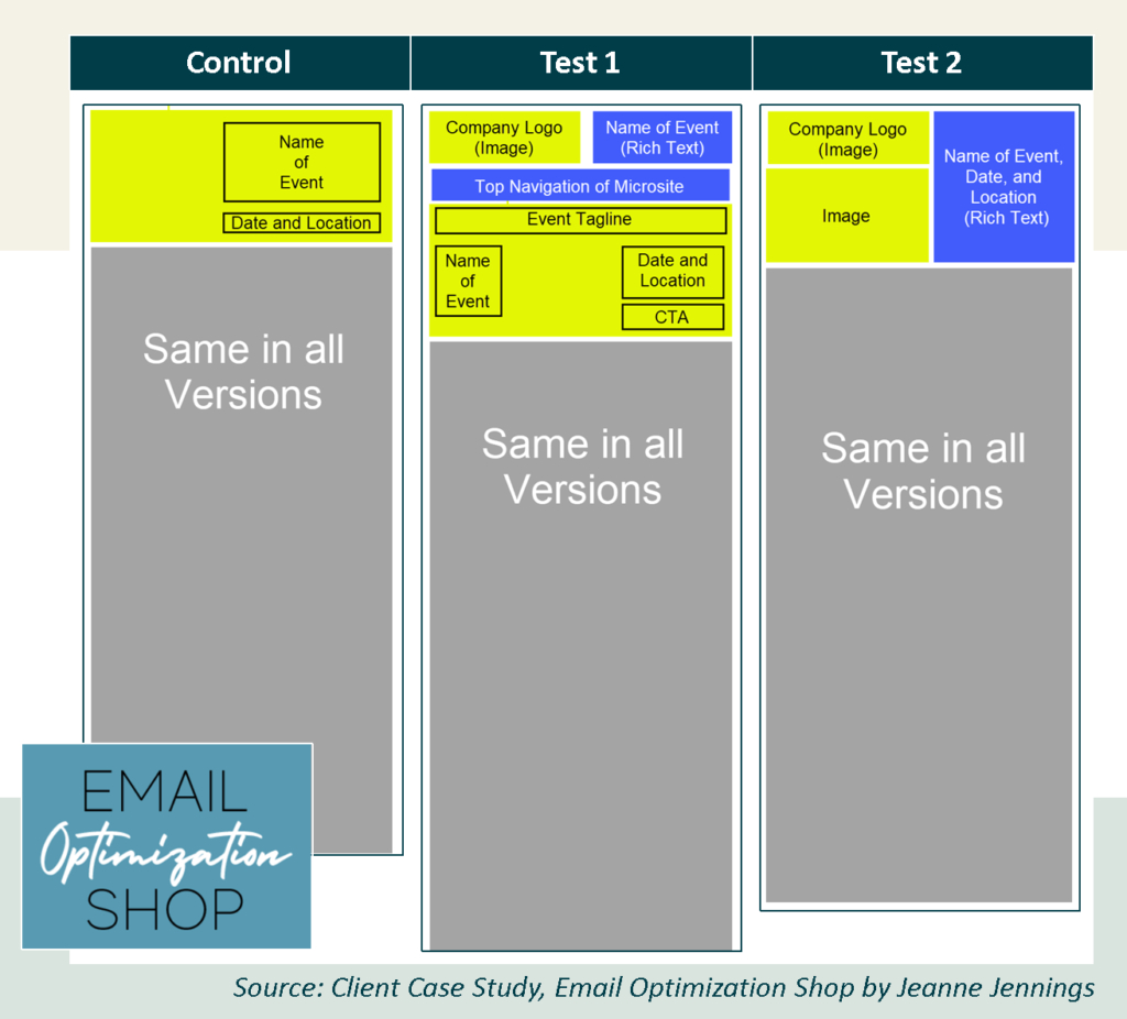
The first, the Control, was currently being used for the campaign. It had a large hero image related to where the event was being held, with the following embedded in the image:
- Name of the event
- Date of the event
- Event location
Test 1 was last year’s header wireframe, updated for this year. You can see that it included a lot more information. At the very top of this header wireframe we have the company logo and the name of the event in rich text. Just beneath this was a full-width navigation bar which mirrors the navigation bar on the event microsite.
Then we had a hero image (this year we used the same image as the Control; last year it was a different hero image related to where the event was held (which was a different city than this year). In this wireframe, the following were embedded in the image:
- Event tagline
- Name of the event
- Date of the event
- Event location
- Call-to-action in a box, making it look like a button
Test 2 was based on my experience with hero images – that they often don’t show due to image blocking and that incorporating some rich text copy at the top of an email usually boosts response.
We included the company logo at the top left, with a half-width version of the image that appeared in the other two versions, without any embedded text.
The following appear next to the logo and image in rich text, so this information will be seen even if images are blocked:
- Name of the event
- Date of the event
- Event location
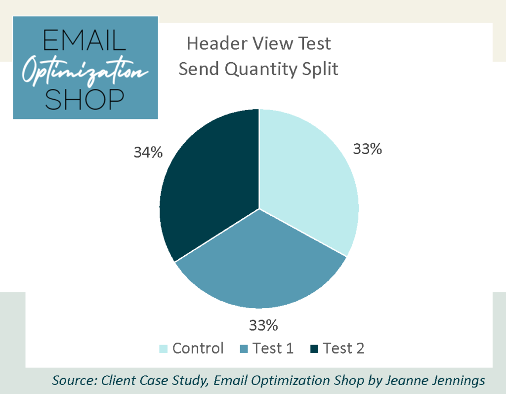
We split our list randomly into three groups (breakdown below). We had plenty of names to meet my standard of at least 20,000 per group, which usually returns statistically significant results.
As always, aside from the header views described above, we kept everything the same.
So, which version do you think drove more revenue? I’ll give you a minute to decide… then scroll down for the results.

Results
Here are the results!
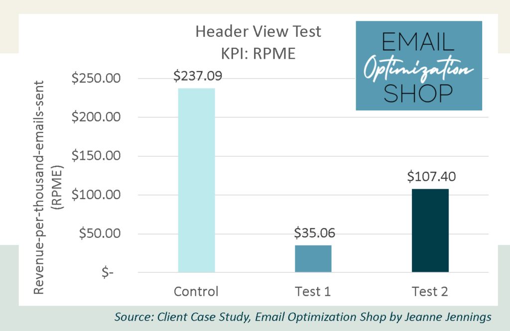
That’s right. The Control bested both tests.
How many of you guessed correctly?
Our key performance indicator (KPI) here is revenue-per-thousand-emails-sent (RPME), because we are looking to optimize revenue.
Note: We used RPME instead of revenue-per-email (RPE) because for this client the RPE numbers were often very small. Increasing the magnitude makes it easier to see variances – and the relative variance between the cells remains the same.
Here are the full results.
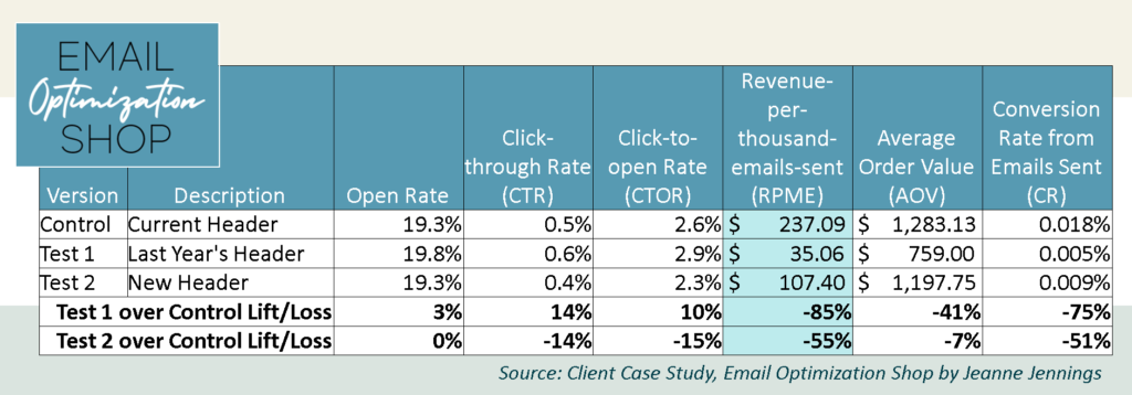
As you saw above, the Control bested the test versions in RPME; Test 1 lagged the Control by 85%, while Test 2 lagged the Control by 7%.
This data can also give us an idea of why the Control did so well.
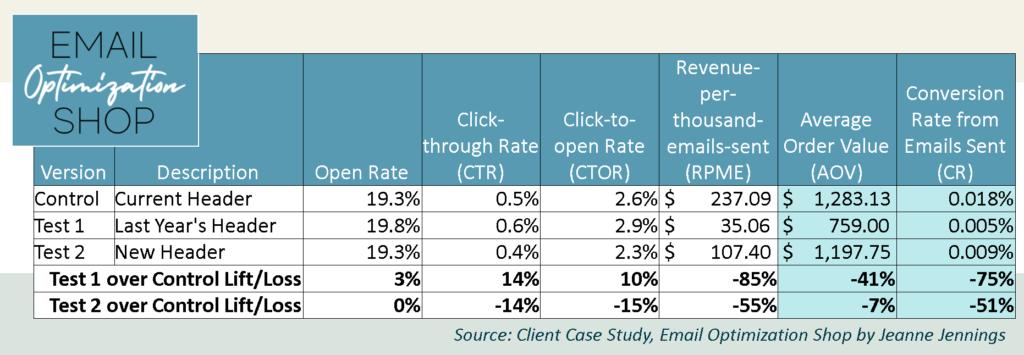
Looking at Average Order Value (AOV), you can see that Test 1 lagged the Control by 41%, while Test 2 was only behind the Control by 7%. The variation in the CRs is even larger; Test 1 lags the Control by 75%, while Test 2 lags by 51%. So the Control converted email subscribers to event registrants at double the rate of Test 2 and more than triple the rate of Test 1.
Just for fun, let’s look at our diagnostic metrics as well.
I’ve published research showing that Click-through Rate (CTR) is not a good proxy for RPE or RPME. This proves it once again. The Control did have the highest RPME but did not have the highest CTR. Interestingly, the Control did not have the highest open rate either. Nor did it have the highest Click-to-open Rate (CTOR). All reasons that none of these should be your KPI when you’re looking for an action past the email click.
Were we surprised by the result?
Yes. Based on my hypothesis about image blocking, I felt strongly that Test 2 would win. If not Test 2, I thought the fact that Test 1 had what looked like a CTA button embedded in the image would make it a winner. I never imagined that the Control would top them both. But it did.
Take-aways
So, does this mean that you should make your header view a hero image with embedded copy?
No.
But it means that maybe you want to test whatever your standard header view is now against a hero image with embedded copy. Or test your current header view against something that looks like one (or both) of the tests.
Give it a try and let me know how it goes!
Be safe, stay well,