Tuesday, July 18, 2023
“Personalization always boosts performance.”
— Conventional Wisdom
This is the fourth blog post in my series on personalization, documenting the journey we took with one of my clients. Here we once again test the conventional wisdom above. Read on for this case study, as well as the links to the case studies on the first three personalization tests we did for this client.
As always, don’t just take these case study test results and apply them to your own program – do your own testing to see how your email subscribers respond to personalization.
Background
Many of the products this client sold were personalized with company logos and names. As a result, showing products that were personalized with the recipient’s name or company logo seemed to make a lot of sense.
This was the fourth personalization test we did; it was a second attempt at a ‘tiebreaker.’
At this point, we had the following results:
Test 3 had been done as a ‘tiebreaker’ – but you see above how that ended up. So, this test was our second attempt to definitively decide whether or not to make personalized email a standard part of our program.
Test Set-up
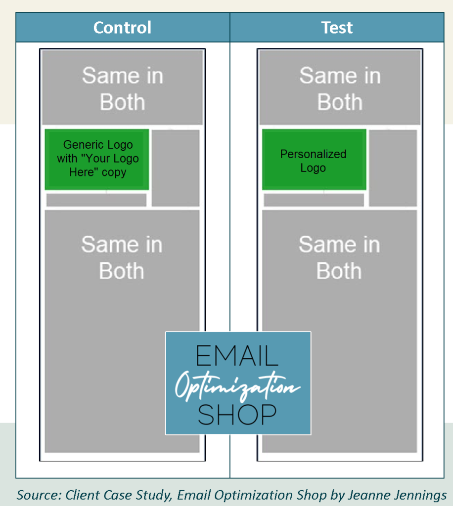
For our fourth personalization test, we decided to test personalizing the logo on a tote bag.
Our control is what we would usually send – it has an image of the product at the top; in the space where the logo would be there’s a generic logo with “Your Logo Here” next to it.
For the test version, we were able to dynamically add the logo of the recipient’s company based on the domain name in their email address. This was used in place of the generic logo, and since it was their logo we were also able to remove the ‘Your Logo Here” copy next to it.
Wireframes of both versions appear below. The gray area was the same for both versions (I’ve truncated the wireframes to save space); the only difference was in the product image, which is green here.
To try to address what we thought may have been a bias in previous tests, we actually split the list into three segments. The first segment was the smallest, at just over 97,000 people – if we would not be able to pull a logo for a recipient, they were put into this segment. Since we didn’t have a logo to use for personalization, this group received the generic logo with the “Your Logo Here” copy version of the creative. Doing this allowed us to be certain that everyone in the other two segments was someone we had a valid logo for.
Once the segment one people were removed, we split the balance randomly into two groups, one of which would receive the generic logo with the “Your Logo Here” copy control and one of which would receive the personalized logo test version.
The control and test groups each had more than 275,000 names in there, well above my minimum cell size of 20,000, which almost always allows me to get statistically significant results. See the split below.
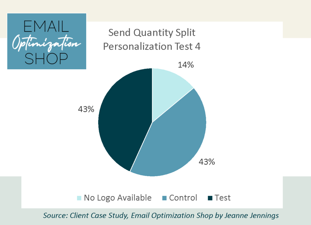
The ‘No Logo Available’ segment isn’t being used for the test, so the quantity there doesn’t matter. For the balance of the list, half received the test/personalized version, while the balance received the control/not personalized “your logo here” version.
As always, we kept everything except the personalization the same, so we could get clear results.
Which version do you think won? Was it the test with personalization? Or the control without personalization?
I’ll give you a minute to think about it… then scroll down to get the answer.

Results
Here are the results!
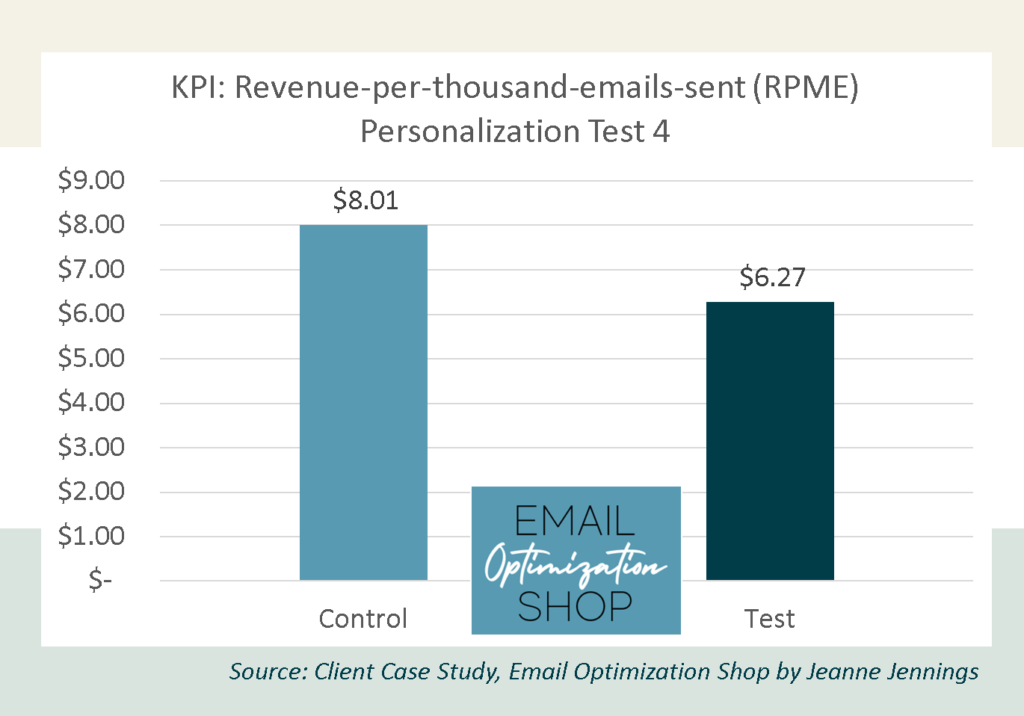
That’s right. The control, which was not personalized, generated a higher average revenue-per-thousand-emails-sent than the test.
How many of you guessed correctly?
Our key performance indicator (KPI) here is revenue-per-thousand-emails-sent (RPME), because we are looking to optimize revenue.
Note: We used RPME instead of revenue-per-email (RPE) because for this client the RPE numbers were often very small. By increasing the magnitude it makes it easier to see variances – and the relative variance between the cells remains the same.
Here are the full results of the test.
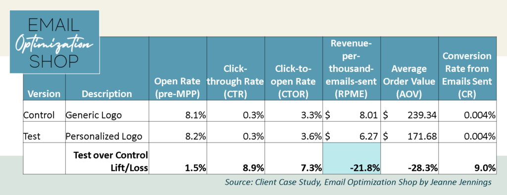
As you can see, the RPME for the test was nearly 22% lower than the RPME for the control version. If we look a little further we can see why the control bested the test.
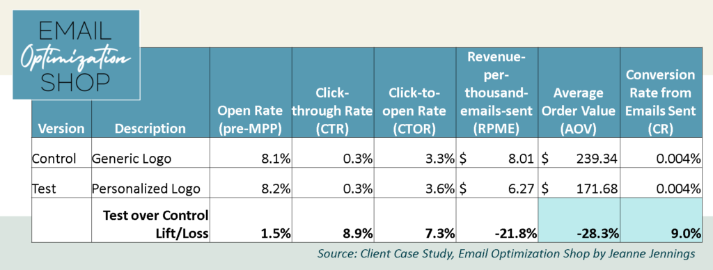
The test had a slightly higher conversion rate from emails sent (CR) than the control (9%), but this didn’t have a huge impact on the RPME figure.
What made the difference was the average order value (AOV). The test had an average order value ($171) that was 28% less than the control ($239). This is the main reason the control won.
Now let’s take a look at the diagnostic metrics…
The test bested the control in both the open rate (this is a pre-MPP send) and click-through rate (CTR). It had a slightly higher open rate (1.5%) and a slightly higher CTR (nearly 9%). But it still generated a lower RPME than the control.
This illustrates something I’ve written about before: that CTR is not a good KPI if you’re looking to generate revenue. Because a higher CTR doesn’t mean a higher RPME.
Were we surprised by the result?
Yes. We were shocked. And saddened. We had such high hopes for personalization after the results of the first test. We hoped that the second test was an anomaly. And we chalked the results of the third test up to poor product choice. We had anticipated that using the logo that correlated to the domain name in the email of the recipient would boost performance. It did not.
Take-aways
So, does this mean that you should not personalize your email messages?
No.
When we debriefed on this test, I learned that the tote bag they used in the product image was a very dark color. So if your logo was a dark color… it was difficult to see it on a dark background. So why not use a white tote bag next time, you ask? Well, if we did that we’d have a similar issue with white and light-colored logos.
I also learned that the space allotted for the logo was square. So light colored square and round logos looked pretty good, although they were pretty small. But a logo that was a lot wider than it was tall – their max width was the width of the square, which often meant that they were not very tall, and as a result very small, often too small to be read.
So, the failed personalization test may be attributed to a non-ideal creative choice.
It’s important to hypothesize about what might have impacted your results, win or lose. Doing this after a losing test is almost more important, as you are often able to adjust your approach and win on your next test.
Which is what we did on our next, our fifth, personalization test. Watch this blog for details…
In the meantime, give it a try and let me know how it goes!
Be safe, stay well,