Wednesday, August 2, 2023
I speak with a lot of organizations that are looking for email marketing help, which is great – many of them turn into consulting clients.
Recently I spoke with a potential client who had a button on their website which caught my eye. It sent me down a rabbit hole of best practice recommendations for event registration forms – and I wanted to share, as I see many B2B companies losing registrations over things that are easily fixed.
Take a minute, read this post, and review your own event registration process to see if you can make it more effective!
What I saw on the website appears below. The button was at the top right of the home page, next to their top navigation, in a very prominent location.
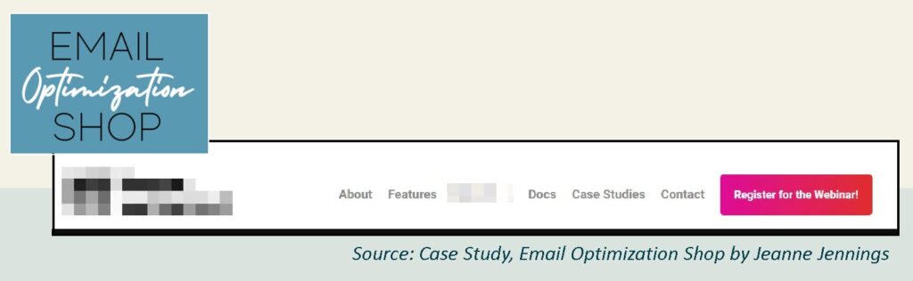
It’s great that they have a regular webinar. The prospect told me that a high percentage of those who attend the webinar end up buying the product. Also great. That’s why they put the button on the home page. All this is good. Really good.
But the call-to-action on the button could be better. How many webinars do you get invited to each week? Do you feel like you need another webinar in your life?
If you’re like me, the answer is a) a lot and b) no.
There’s no cost to register for the webinar, but you still need to use your marketing skills to entice people to sign-up.
And this button doesn’t do that.
Looking at the full description of the webinar, which appears when you click the link, there are some benefits listed that could be used on the button, including (some information redacted for anonymity):
- Learn how to streamline your operations
- Learn how to boost your
- Learn how to enhance your with AI
- Learn how to transform your
- Get a free T-shirt!
Are they longer than the current CTA? Yes, some are. But they’re all more benefit-oriented than the current and they should drive more people to click on the button and then follow-through and register for the free webinar.
Before I made my recommendation on making the button copy more benefit oriented, I asked about performance. What percentage of website visitors click on that button? What percentage of website visitors register for the webinar?
The prospect didn’t know.
You want to know how well your marketing efforts, even those which don’t directly generate revenue, are working. Looking at what percentage of website visitors take an action you want them to take is critical to success. It gives us a baseline for testing – and it allows you to focus on improving weaknesses in your program – or on doing more of what’s working. Here’s a case study with the formula I use for this.
Next stop: the webinar registration page. I did end up clicking on the button, mostly out of curiosity to learn what the webinar was about. Here’s what I saw before I scrolled (some information redacted for anonymity).
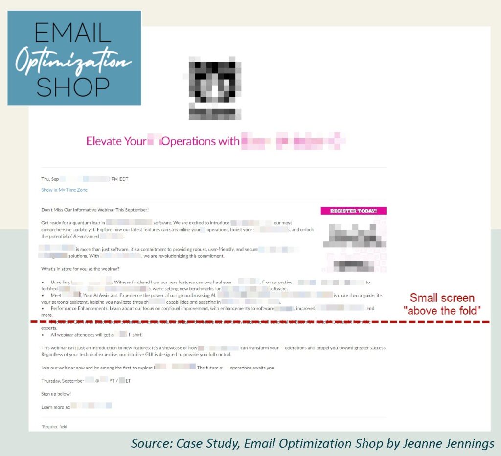
Note that how much of the page is shown “above the fold” (before scrolling) varies based on the size of the screen. On a smaller screen, less of the page is shown (see the dotted red line).
What do you see? I saw a large logo, a headline, and lots of copy – with no fields to enter my information to register for the webinar.
There’s a lot of wasted space around the logo – if you shift the logo left and put the headline to the right of it, you’ll pull more of the page content into the initial, ‘before you scroll,’ view.
You want people to visually see how they can register when they land on this page. You don’t want to make them scroll. Making this change for a client a while back resulted in a 350% increase in conversions.
The headline is pretty good, it does suggest a benefit. But I’d test using some of the more specific benefits as headline. Also, ‘elevate’ is good – but saving money or time is better.
The reason we use bullet points is because they make the content easier to skim. But the bullet points here are so long that they negate that benefit. Be sure your bullet points are easy to skim.
The good news – this description did a much better job of outlining the benefits of attending the webinar. The bad news – you had to dig into the copy to get them.
If you’re doing something special, be sure to call it out! Do you see the last bullet point (it’s below the dotted red line). It says that all webinar attendees get a free t-shirt.
We can debate whether or not this is an effective way to drive attendance. But it might – and it is a unique offer. And I missed it totally – until I dug in to dissect this page for this post. If you’re going to do something like this, make it prominent on the page. I’d try it as the headline – “Learn How to Elevate Your Operations – and Get a Free T-shirt.” Many years ago, I tested a headline like this in an email and it increased conversions by 220%.
Once I scrolled down, I was able to see the fields I needed to complete to register for the webinar; they appear below.
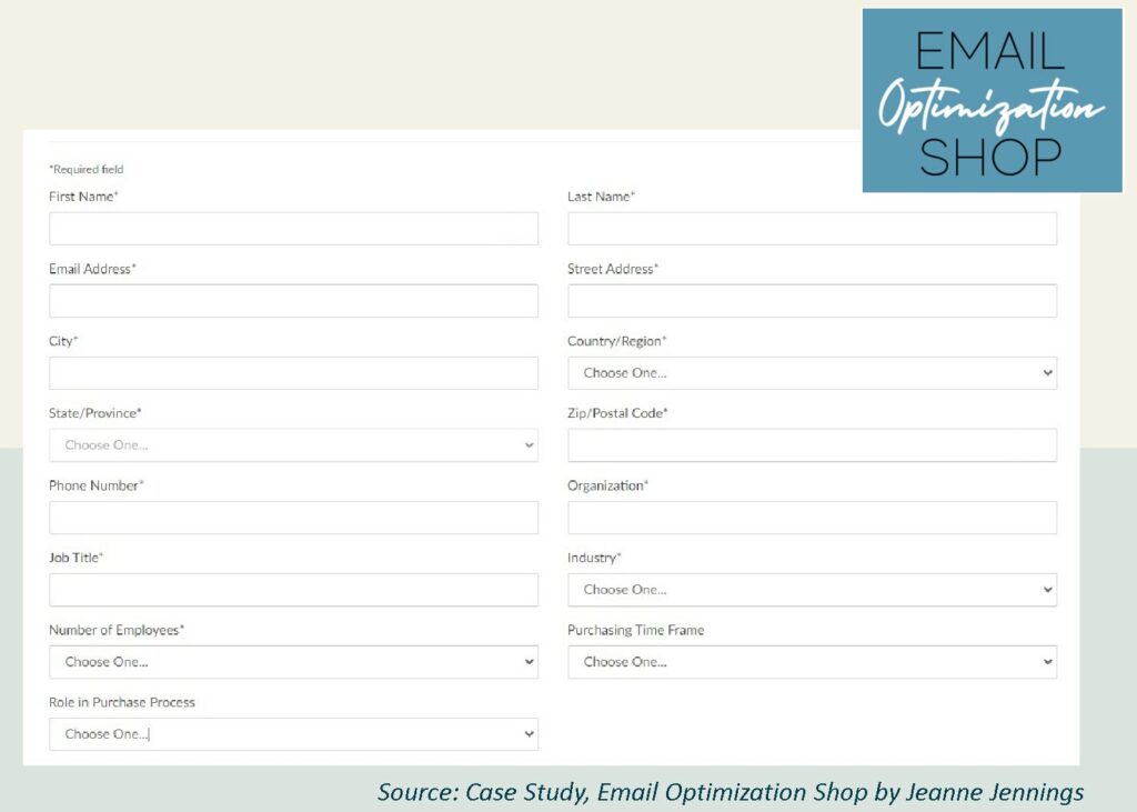
Wow. This is a lot. Do they really need all this information to send me an invitation to their webinar? Let’s see…
First Name (required)
Okay, I’m fine with this. They want to personalize the emails they send me. That’s cool.
Last Name (required)
Hmmm… I’ll allow it. I doubt they are going to call me “Ms. Jennings,” but what the heck.
Email Address (required)
Okay. Sure. I understand why they need this. See the next tip about asking for a business email address below.
Street Address (required)
Huh? Now that I’ve seen the note about the t-shirt, I guess they need this to send me my t-shirt. But they should reiterate that here. They certainly aren’t going to send me direct mail to invite me to webinar.
Since this is a required field, this leaves the potential registrant with a few options:
- Provide your actual street address, even though they don’t explicitly say how they are going to use it.
- Provide a fake street address, which protects the registrant’s privacy but may waste the time/resources of the company running the webinar.
- Abandon the form and don’t attend the webinar, which is a bummer for the company, as people who were somewhat interested in their product are now turning away from learning more.
Other options:
- ask for this – but don’t make it required
- ask for this – but on a second page of registration, after the visitor submits the key information you need to invite them to the webinar (which, at a minimum, is email address).
City (required)
See the note above about street address.
Country/Region (required)
Ditto the above
State/Province (required)
Ditto the above.
Zip/Postal Code (required)
Ditto the above.
Phone Number (required)
Are they going to call me to provide information on attending the webinar? I think not.
This screams ‘we’re going to have a sales rep call you.’
Webinars like this are a good low-commitment way for potential prospects to learn about your product offering. So asking for a phone number, especially when it’s a required field, is a disconnect. It’s likely too soon in the relationship for this.
See the bullet pointed options (both for registrants and for other ways to handle this) under “street address (required).”
Organization (required)
This is fine. Most people understand that the company running the webinar wants to be able to qualify attendees as good or poor prospect, and this is a legitimate ask toward that goal.
But see the tip about asking for a business email address below.
Job Title (required)
Okay. I’ll allow it as part of prospect scoring. But do they really need this to invite me to the webinar? Will I not be invited if my answer doesn’t match what they’re looking for?
Industry (required)
See the note above about ‘job title (required).
Number of Employees (required)
Seriously? Ditto the above.
Purchasing Time Frame
Glad this isn’t required. But seriously? What does this have to do with my learning more about your product. I don’t know if I need or want it yet, so how can I know when I might want to buy it. See the note about ‘low commitment’ under the ‘phone number (required)’ field – it’s too soon.
Role in Purchasing Process
Again, glad it’s not required. But it’s too soon. Ditto the above. If I’m not a decision-maker will I not be invited to the webinar?
TL;DR
Here’s the short version of this long analysis. This company is using a detailed lead generation form as a webinar registration form. This is a mistake that many B2B companies make.
The good news: people who complete the form with their actual (not fake) information will likely be very highly qualified, very hot, prospects. They’re likely at the bottom of your sales funnel and they should close quickly.
The bad news: people who aren’t yet at the bottom of your sales funnel, who are interested in learning more about your product but who aren’t yet sure they want to buy, will likely abandon the form.
This is fine if you only want ‘ready to buy’ prospects to attend your webinar. But webinars like this are often good tools to fill the top of your sales funnel with people who can be nurtured to the bottom of the funnel. And this form will likely turn those people away.
Many B2B companies ask for a ‘business’ rather than a ‘personal’ address; this allows them to see which organization you work for (as most entities have their domain names in the email address) and it makes it easy for them to look at your website to see what your business is. This helps them determine if you are a qualified prospect.
If you ask for a business address, it also means one less field – because you don’t need to ask them for their organization name.
So we’re through the registration fields of an event registration form. Watch for part 2 of this post where you’ll find tips for the opt-in, your buttons, the confirmation email — and more!
In the meantime… there’s no reason not to implement these tips on your event registration pages! Let me know how it goes.
And if you need help… I’d love to speak with you (email me!) about a consulting engagement. This type of analysis, paired with help executing on the recommendations, is how I help my clients boost their bottom line results!