Thursday, March 23, 2017

Good day, I’m
Bernadette Wright, program evaluator with
Meaningful Evidence, LLC. Conducting interviews as part of a program evaluation is a great way better understand the specific situation from stakeholders’ perspectives. Online, interactive maps are a useful technique for presenting findings from that qualitative data to inform action for organization leaders who are working to improve and sustain their programs.
Rad Resource: KUMU is free to use to create public maps. A paid plan is required to create private projects (visible only to you and your team).
Here are the basic steps for using KUMU to integrate and visualize findings from stakeholder conversations.
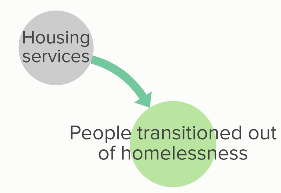
1) Identify concepts and causal relationships from interviews.Using the transcripts, you focus on the causal relationships. In the example below, we see “housing services helps people to move from homelessness to housing” (underlined).
 2) Diagram concepts and causal relationships, to form a map.
Next, diagram the causal relationships you identified in step one. Each specific thing that is important becomes a “bubble” on the map. We might also call them “concepts,” “elements,” “nodes,” or “variables.”
Lessons Learned:- Make each concept (bubble) a noun.
- Keep names of bubbles short.
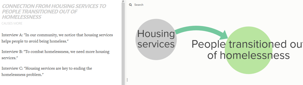
 3) Add details in the descriptions for each bubble and arrow.
When you open your map in KUMU, you can click any bubble or arrow to see the item’s “description” on the left (see picture below). Edit the description to add details such as example quotes.
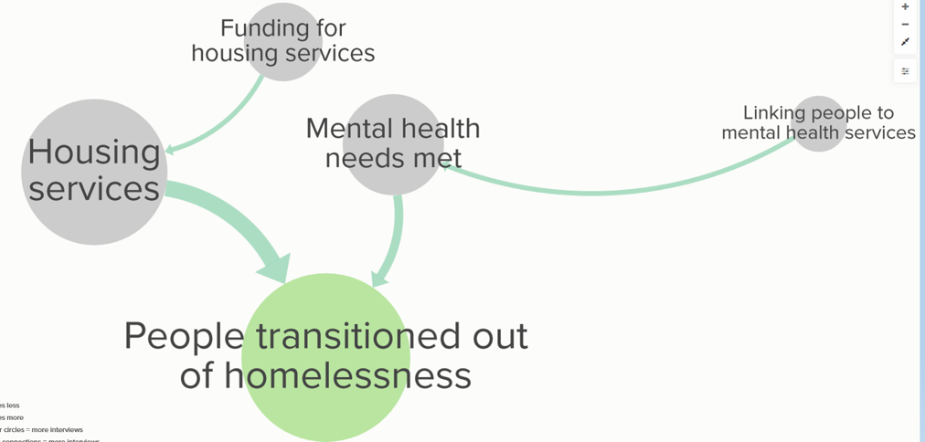
 4) Apply “Decorations” to highlight key information.
You can add “decorations” to bubbles (elements) and arrows (connections) using the editor to the right of your map. For the example map below, bigger bubbles show concepts that people mentioned in more interviews.
Also, green bubbles show project goals, such as the goal “People transitioned out of homelessness.”
 Cool Tricks:
- Create “Views” to focus on what’s most relevant to each stakeholder group. To make a large map manageable, create and save different “views” to focus on sections of the map, such as views by population served, views by organization, or views by sub-topic.
- Create “Presentations” to walk users through your map. Use KUMU’s presentation feature to create a presentation to share key insights from your map with broad audiences.
Rad Resources:- KUMU docs. While KUMU takes time and practice to master, KUMU’s online doc pages contain a wealth of information to get you started.
- Example maps. Scroll down the KUMU Community Page for links to the 20 most visited projects to get inspiration for formatting your map.
- KUMU videos. Gene Bellinger has created a series of videos about using KUMU, available on YouTube here.
Organizations we work with have found these map presentations helpful for understanding and the situation and planning collaborative action. We hope they are useful for your evaluation projects!
Do you have questions, concerns, kudos, or content to extend this aea365 contribution? Please add them in the comments section for this post on the aea365 webpage so that we may enrich our community of practice. Would you like to submit an aea365 Tip? Please send a note of interest to aea365@eval.org . aea365 is sponsored by the American Evaluation Association and provides a Tip-a-Day by and for evaluators.