Tuesday, February 1, 2022
When we test, we’re usually looking to boost performance. But you can get some great learnings even if the control wins. Case in point: this case study from 2020.
This email was part of an annual campaign; as such, I went back to the 2019 creative and results to put together my 2020 plan.
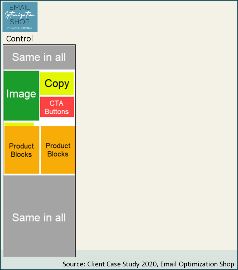
The control here was second in revenue-per-email-sent (RPE) in 2019; we updated it with the 2020 date, as well as new products and images. You can see a wireframe of it below.
The large image (green in this example) is specific to each year’s campaign; copy and call-to-action (CTA) buttons appear to the right of the image. Each ‘product block’ contains a product image, product name, and a link to visit the product’s page on the website.
The initial hypothesis was that adding products to the email would increase the RPE. So we decided to double the number of product blocks included, to four. You can see Test 1 below, next to the control. Nothing else changed.

As we were getting ready for the send, word came down that the control wireframe we were using had been updated about six months after last year’s campaign. They suggested we use the ‘new’ wireframe for the test, instead of the ‘old’ one.
I asked if they had tested into the new wireframe; no, I was told, we just wanted a change and we like the ‘new’ one better. So, I asked to take a look at it. It was noticeably different from the control (more on that later). I was concerned that the changes may have hurt, rather than helped, performance.
Instead of replacing the Control and updating Test 1 with the ‘new’ wireframe, we made the ‘new’ wireframe version a ‘Test 2’ version (see below).
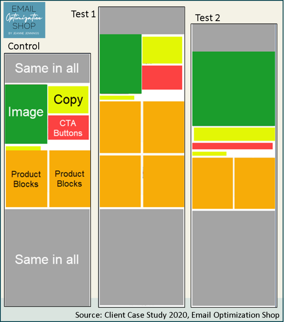
The ‘old’ 2019 wireframe (Control) has a half-width image at the top, with copy and CTA buttons to the right of it. The ‘new’ wireframe (Test 2) has a large, full-width hero image, with the copy and CTA buttons below it. The rest of the email is the same as the Control.
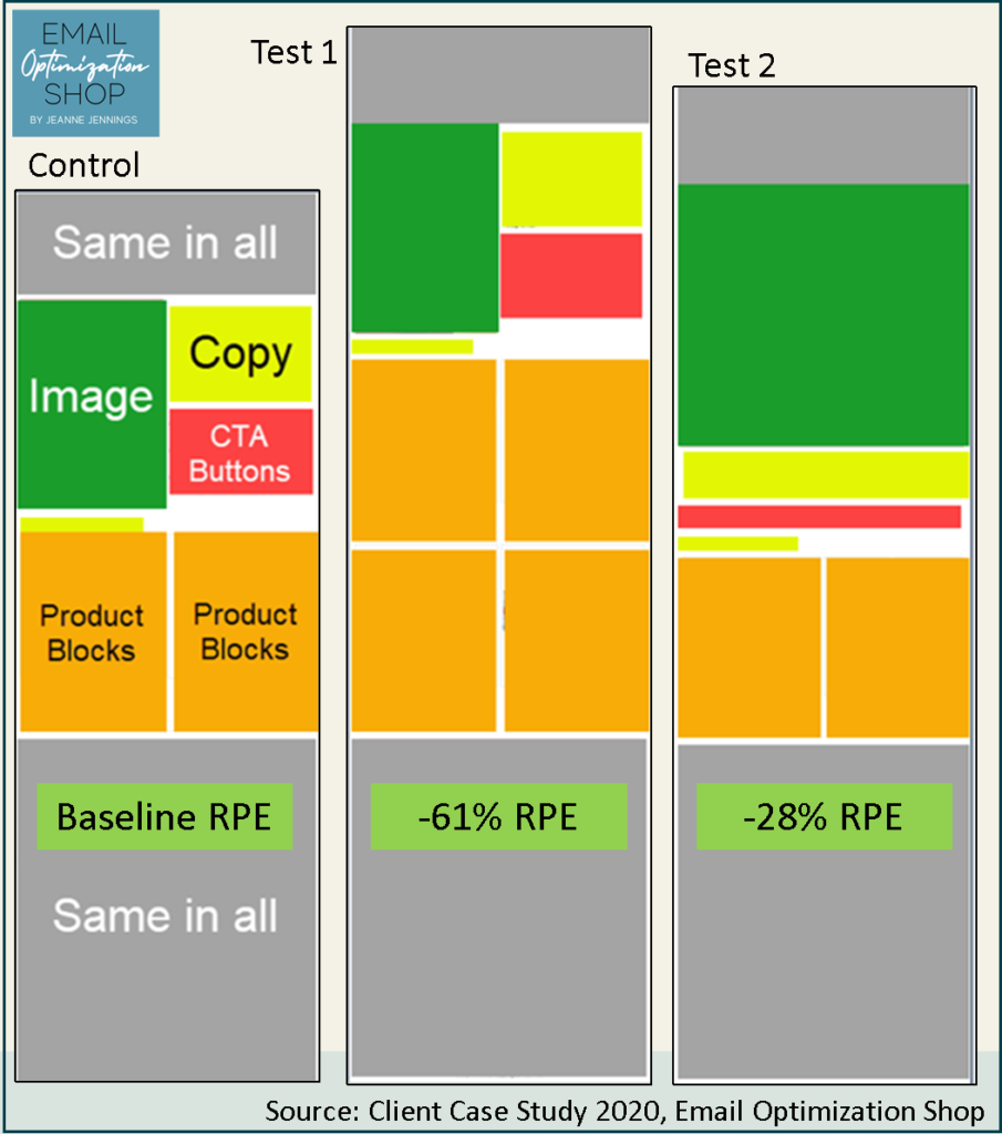
So, take a close look at all three versions of this email. We did a head-to-head test, splitting our send quantity randomly into thirds. I’d ask you which version you think won, but the headline of this blog post gives it away. The Control won.
So instead, I’ll ask you why. Why do you think the Control beat both Test 1 and Test 2?
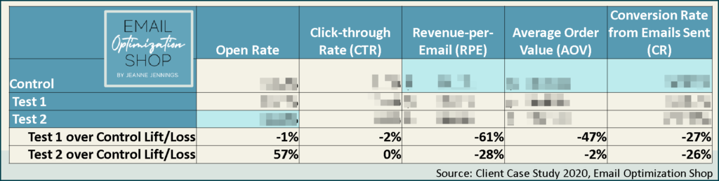
And I’ll provide you a bit more data about the send:
Here’s what I think.
Let’s start with why the Control (‘old’ wireframe) beat Test 2 (‘new’ wireframe) and the implications of this beyond this send.
In my experience, emails which have rich text in the preview pane, aka the top of the email, do better than messages which have only images at the top. My theory on this has to do with image blocking. We know that many email clients still block images by default. So when the top of the email is primarily an image, as it is with Test 2, and images are blocked, there’s nothing there to engage the reader.
My theory? That the Control beat Test 2 because even with images blocked the copy (which was rich text) was there to engage readers.
I believe this to be true even though Test 2 had a higher open rate than the Control. Some marketers say they like having just images at the top of the email because they believe the ‘blank space’ drives recipients to enable images (which triggers an open), to see what’s there. These results suggest that could be true; blocked images may drive people to open. But even if they do, it doesn’t mean they’ll end up buying, as seen in the 26% lag in orders for Test 2 compared to the Control.
And the impact beyond this send? Remember they told me that they had made this change roughly six months after the last annual campaign, which would have been about six months before this send?
These results suggest that every time they mailed an email with the ‘new’ wireframe (Test 2) they earned 28% less revenue than they would have earned if they had mailed the email using the ‘old’ wireframe (Control). Multiple this by at least one send a month and the lost revenue begins to add up. This is one more reason to always test into material changes to your email campaigns. If you don’t, you could be leaving money on the table.
And why do I think that the Control beat Test 1?
The Control had two product blocks, Test 1 had four product blocks. Otherwise they were exactly the same.
I don’t know. Maybe because there was too much going on, too much choice, and it caused people to leave without making a purchase.
Looking at the additional data, you’ll see that all three versions had roughly the same click-through rate. Even so, the Control bested Test 1 in AOV and CR; Test 1 lagged the Control by 47% and 27% respectively in these metrics.
This is one more example where click-through rate is not a good Key Performance Indicator (KPI); here it would have told us the test was inconclusive, when in reality the Control clearly drove more revenue than either of the Tests.
Moral of the story? Always be sure to test into any changes you make to your email. This is true even if the change seems inconsequential. Give it a try the next time you are thinking of making a change and let me know how it goes.
Be safe, stay well, peace,
jj